Getting The Letters Right - Iconic Font Project Pt.6
Finding My Way…
The Long Walk Ahead.
I’ve learned MANY things over the last few days. The first and foremost thing being that there is light at the end of the tunnel of this font project. However, that light is still far, FAR, away.
Aside from the aforementioned stint with jury duty, (to clarify, I’m not totally in the clear just yet… still on call for a few more days,) I’ve not written much this week, for the simple fact that font making, atleast at this stage in the process, is not all that entertaining. On the contrary, I have been faced with the tedious task of going letter by letter, attempting to perfect each shape, (that’s right, just the SHAPES,) and build a cohesive foundation for my font.
You see, finding and matching letter shapes together takes a bit of finessing. You have to develop a flair for it — get into the groove of it. You almost have to live in letters, in a sense. Your receptors go up, and you begin to see new and interesting typography EVERYWHERE.
I found the PERFECT capital “D” last Wednesday. It was stamped into the DeMontrond dealership logo on the license plate of a car in front of me, while stopped at a red light. I had about a split second to pull my phone out and take a quick snapshot before the light turned green, so at the time I felt pretty proud of myself for noticing it, and especially for successfully and safely accomplishing the deed of documenting it.
There was also the moment I found one distinctive letter “A” on page 39 of Julien Chazal’s Calligraphy: A Complete Guide that made me think of little faerie wings, and I was so entertained by it that I ended up re-fashioning my entire letter scheme in order to mold my existing font to a new vision that faintly resembles a feeling of flying — kind-of an in and out, wavy motion within the text, which may or may not be all that apparent, but does give a sense of motion to the letters, in my humble opinion.
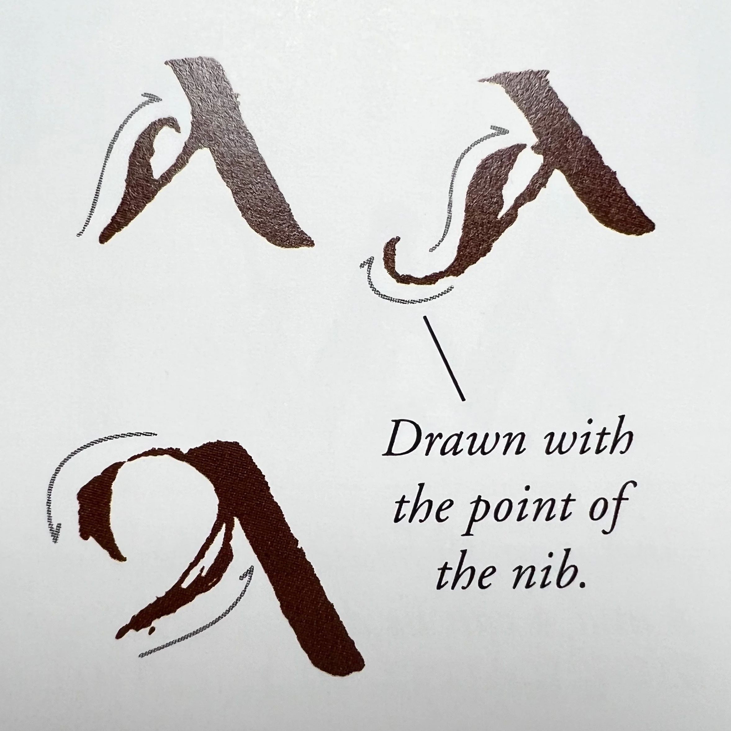
Image Courtesy: Calligraphy: A Complete Guide by Julien Chazal
I’ve had a few moments this week, where letter shapes and small flourishes, (like an idea of small bulbs on the ends of some of my letters, inspired by a singular cone growing on the end of a pine tree branch,) just came to me in serendipitous and inspired ways, and then found their way into my font with minimal effort.
Do I think I’ve found my groove yet? Maybe. Truth be told, more than half of the alphabet still eludes me even as I type this post.
All I know, is that I sure do LOVE my new “A’s.” (Hopefully, I’ll feel this way about every letter by the end of this project.)
Back and Forth…
I’m also learning that font-making isn’t as straightforward of a task, as one might assume at first glance — not as simple as creating an “A”, and then a “B,” a “C,” and so on and so forth.
Creating a font has been more of a back and forth between thinking up a letter shape, and then drawing and pasting it into the font-making software, typing with it and seeing how that new letter shape fits with the letters I’ve already made… and then tweaking it a little more, ad nauseam.
My New Method
For the sake of my sanity, I developed a method where I began writing familiar words inside the software — words that are either decidedly in my books, or at least in the spirit and theme of the stories contained within them, and I’ve found that doing this has alleviated the process TREMENDOUSLY.
Instead of drawing and editing letters by themselves, I now edit them within the context of those words, and the results seem to add life to the letters that simply wasn’t possible to me before utilizing this method, (a bit of a GAME-CHANGER for me, as you can imagine.)
Final Thoughts
I’m about halfway through the initial stage of the project, and though I have MANY letters to go, I am so happy with where the font is headed. The process is becoming smoother now, and I’ve made enough progress to envision what it will look like when complete. I’m past the initial hurdles, and feel like my font is shaping up to be something every bit as unique and magical as I was hoping for.
Anyway, I can clearly see in the picture above, that there’s a capital “M” and a whole bunch of other letters begging for some attention, so I’m going to quit typing now, and get back to work on my alphabet. I’ll talk to you again soon.


