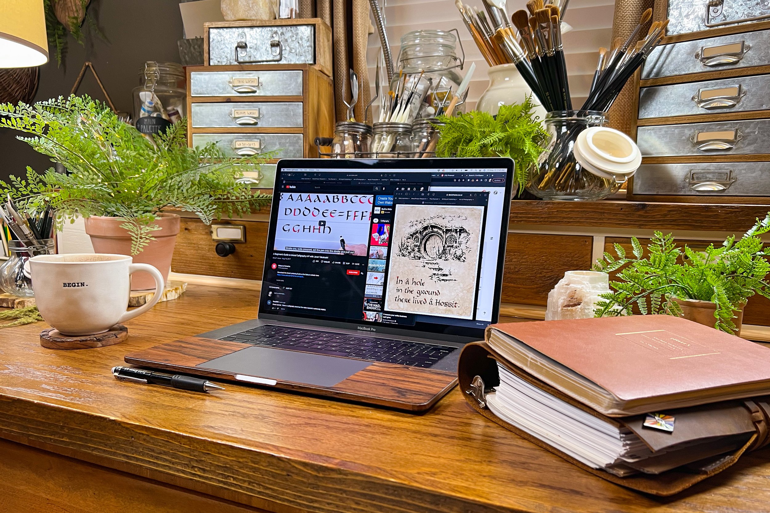
One Type Face to Rule Them All - The Iconic Font Project, Pt.4
Tolkienesque Typography
And Celtic & Gaelic Lettering
As much as I love the letter styles used in The Lord of the Rings and Hobbit movies, it’s no wonder that my taste in typography is heavily influenced by them, however, the font for my books needs to be truly unique, so simply taking inspiration from those fonts alone, won’t be enough.
Their type faces are obviously based on letter styles of old. But what are those letter styles? What are their names? I realized how helpful knowing these things might be, the moment I opened up a browser window and clicked that little search box on Google.
I knew at a glance, that the LOTR letters were created in the style of traditional Celtic and Gaelic typography, but beyond that, I initially had NO IDEA what to type, in order to find out more about them. (Those books I have coming in the mail, should be quite helpful with this.. fingers crossed.)
So, I decided to start by looking up who the creators of The Lord of the Rings typography were, to hopefully learn more about what influenced their work, and I came across a number of invaluable websites.
Three Websites…
Firstly, Daniel Reeve
Almost, if not all of the letter work for both LOTR and The Hobbit was created by one artist, Daniel Reeve.
Daniel Reeve is a MASTER calligrapher, based in New Zealand. I wasn’t able to find out what his primary influences are, but I was able to find his personal website, and TONS of inspiration on his gallery pages. I’ve linked them here.
Nancy Lorenz
During the heyday of the LOTR movies, there was also a lesser known calligrapher making a name for herself, by creating “free-for-personal-use” fonts inspired by the movie sets themselves. Admittedly, above any other font in the world, her rendition of LOTR lettering, called “Hobbitan Brushhand” is of the highest inspiration to me. “Hobbiton Brushhand,” is one of those fonts you look at and say to yourself, “Dang, I wish I had come up with that!”
It embodies a number of characteristics I want to portray in the font I’m making for The Goldwater Prophecies, so I will likely be using it as an initial template for my own lettering. I’ve included a link to her website below.
Learning about FontSpace.com
Amid my deep dive, I also came across a collection of fonts on a website called Fontspace.com, aptly named, “Hobbit Fonts.”
This list currently consists of sixteen LOTR inspired fonts, for download, and includes Nancy Lorenz’ fonts for download, as well.
The Research Continues
Diving Into Uncial Calligraphy
Aside from the research I did regarding LOTR fonts, I also went deeper into my studies on Youtube, focusing on a type of calligraphy called Uncial.
Right now, I’m basically getting familiar with letter forms, especially in Celtic and Gaelic Alphabets while I wait for those calligraphy books I ordered to come in.
Here’s some of what I’ve been watching the last two days:
Final Thoughts
The look of Uncial calligraphy seems to call to me. I just really enjoy it. But there’s something a little too Celtic looking to me. I haven’t pinpointed what it is that makes me feel this way, but I have an idea.
I think it’s mainly the fact that a hallmark of Uncial lettering is the pronounced roundness within the letters, which makes for slightly wider characters than I want in my font.
I think I will attempt to take what I love so much about it, (the look and general style of the letters,) but maybe incorporate them in a way that doesn’t take so much space from side to side, and that also doesn’t feel quite so formal.
I’d like the font to be a little less “Irish monastery,” a little more “well-traveled, but retired, explorer” — rustic, with a little more of a, “leather field journal,” aesthetic. I’m really going for more of a country garden, Cotswalds, cottage-core look, so maybe I’ll try to find some English influences to add to the mix, but I’m not sure yet.
That’s probably a lot to unpack right there, but I guess time will tell if I can achieve the look or not.


